To understand and forecast the currency price movements while making well-informed trading decisions, traders often make use of analysis tools either available online or offered by Forex brokers.
One of these tools is the candlestick chart that shows current and historical prices.
In this guide, we will look into how a candlestick chart works and what common patterns that traders look out for to predict market movement.
Anatomy of Candlestick and its Types
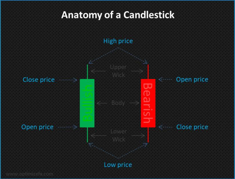
The candlestick chart gets its name as to how it resembles a candle and a line that resembles a wick. When reading a candlestick chart, each stick would indicate an open, high, low, and close price for a specific time frame chosen. Here is what you may see when accessing a chart:
On a chart, you will notice how the candlesticks are will usually be in two colors. The colors can depend on the type of candlestick chart and the analysis group publishing it.
When the closing price is higher than the opening price, the candles are usually in green and are known as bullish candlesticks.

When the closing price is lower than the opening price, the candles are usually in red and are known as bearish candlesticks.
The wick’s highest point situated at the top of the candlestick’s body represents the highest price the currency pair has reached during the time.
The wick’s lowest point (or the tail or shadow) situated at the bottom of the candlestick’s body represents the lowest price the currency pair has reached during the time.
Reading a Candlestick Chart
With the anatomy of a candlestick in mind, the next step is to understand what a series of candlesticks in a chart format visually represents.
As the candlestick’s body is made up of open and close prices, one that does not have an upper or lower wick would mean that the opening or closing price was also its highest or lowest price for the interval respectively.
It is also possible for opening and closing prices to be the same and would be in a third color to distinguish them from the others as they are neutral and neither bullish nor bearish.
When reading a candlestick chart, it is at times considered akin to reading a sentence. Looking at one candlestick alone is like reading one word in a sentence. Therefore, reading a series of candlesticks will give you an idea of where its “story” is heading, and in this case, where the market’s direction is heading.
And when analyzing the data on a much higher time frame, the more you understand the market’s dominant price trend.
This can be done by finding candlestick formations, and it is essential to remember what kind of variations are there and what the context of their appearance is to interpret its meanings.
Blending Candlesticks
If reading a candlestick sequence is the same as reading a sentence, then blending candlesticks can be a summary of what you just read. When blending candlesticks, you allow yourself to view the price data with great or lesser detail over any timeframe and may even help you discover hidden signals in terms of market trends.
Below is an example of how blending candlestick charts would be analyzed:
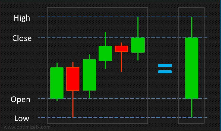
In the case of this image, the candlesticks on the left represent the day’s price movement in 4-hour intervals, and the one on the right represents one day’s worth of price action. Overall, the movement was bullish and as such, is colored green.
By taking the points of the opening price of the first interval, the lowest amount of the day, the highest amount of the day, and the closing price of the last interval and “blending” or presenting them onto one candlestick, you get a summary of the price action during the timeframe from the left.
Approaching Candlestick Charts to Analyze
The goal of analyzing candlestick patterns is to identify its dominant, medium-term, and short-term trends. Knowing these can help traders make better decisions when trading in Forex.
The idea is that when trading in the same direction as the dominant price trend, the probability of profitability increases.
Before analyzing candlestick patterns, it would be advised to take a top-down approach to it. This approach starts from a broader timeframe and from here; go towards a narrower one.
An example of this can be explained with the charts below for AUD/USD:

As you will see, these charts represent the short term, medium-term, and long term price trends respectively.
Keep in mind that charts show different timeframes and in various detail. However, the data is the same. The timeframe that you use to analyze can highly depend on your trading goals.
Practicing to read candlestick charts can be as tricky as it sounds, so the best advice would be to open a demo trading account and check out its analysis tools.
Once you get an idea of how candlestick charts work, you may start looking for a variety of trading opportunities when spotting candlestick patterns such as the “Three Black Crows” pattern or the “Evening Star” pattern.
Key takeaways
A candlestick chart is an essential tool that will help you get an idea about market trends and even discover signals to act upon it beforehand appropriately.
Lastly, the utilization of candlestick charts should be in conjunction with other tools and techniques. It is also better to first try out your observations and procedures on a trading platform’s demo account.